Picture this scenario: After typing a search query into Google, someone who fits your target audience lands on the services page of your company’s website.
They start reading some of the compelling content on your home page, are impressed with your branding, and have a quick browse of your About Us page. They get the information they’re looking for.
Then, they leave. Later in the week they visit the website of a competitor and book in a consultation with them. Why? Because your website wasn’t designed with conversion in mind. Had your landing pages been optimised for conversion, this situation would look very different.
What is a landing page, and why is designing them for conversion so important?
A landing page is a page of your website that someone “lands” on as a result of organic search or paid advertising through social media or Google Ads.
Conversion rate refers to the percentage of people who visit your website and perform a defined action. According to HubSpot, increasing your landing page conversion rate from 3% to 7% will result in a 133% increase in leads (Hubspot).
As the above hypothetical example demonstrates, a website that doesn’t put conversion first and foremost will struggle to achieve the digital marketing goals your business is after. If there’s no strategy driving your website design you’ll struggle to convert visitors into leads.
“Increasing your landing page conversion rate from 3% to 7% will result in a 133% increase in leads (HubSpot).”
Whether you’re an ecommerce website wanting someone to buy your products or a consultancy service wanting your visitors to book a meeting with you, you need to communicate loud and clear what it is you want them to do. There’s no point having stellar branding and compelling copy if your visitors don’t understand what action they should take.

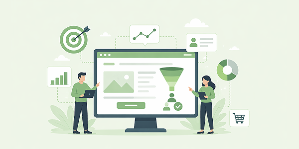
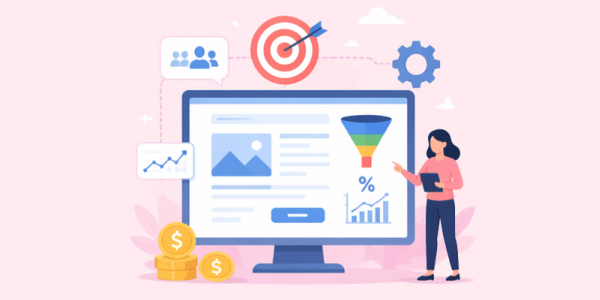
What does a landing page designed for conversion look like?
A visible call to action: Great landing pages have obvious calls to action so visitors know exactly what they need to do. This doesn’t necessarily mean placing the call to action smack bang in the middle of your landing page, it just needs to be very clear what action is required.
Appealing visuals: Ensure your landing page has some high quality, attractive visuals that will render well on mobile devices as well as desktop. Steer clear of overly stocky images as these can have the opposite effect.
Make the value clear: Your visitors want to know what they’re going to get in exchange for sharing their personal information with you. Explain in the accompanying copy what will be included in the eBook you’re offering, the e-newsletter they’re signing up for, or the free consultation they’re booking.
“Your visitors want to know what they’re going to get in exchange for sharing their personal information with you.”
Clean, concise copy: Good conversion landing pages should provide a positive user experience and not be overwhelming for visitors. They should contain concise, informative copy divided into subheads and bullet points to make the text easy to digest. Limit the number of form fields to five or less to make filling it out as simple as possible.

Top tips to optimise your landing pages for conversion
Set up conversion goals in Google Analytics: You won’t know if your efforts are working unless you can measure changes over time. Set up conversion goals and get a report delivered to you every week, month or quarter to track how many people have submitted a form or completed a purchase – whatever your conversion goal may be.
“Only by testing will you know what works and what doesn’t, and be able to make small adjustments over time to improve your conversion rate.”
Test continually: If your landing pages aren’t getting the results you’d like, change things up. Try some new copy, use a different image, or position the call to action in another place. Only by testing will you know what works and what doesn’t, and be able to make small adjustments over time to improve your conversion rate.
This is a blog article, not a landing page, but we wouldn’t be doing things right if we didn’t take the opportunity to encourage you to take action right now!
Let’s chat about how our expert team can help you optimise your landing pages for conversion.
Sources
https://mailchimp.com/resources/landing-pages-design-tips/
https://www.crazyegg.com/blog/landing-page-essentials/
https://www.shopify.co.nz/partners/blog/landing-page-optimization